
In the Overview tab, you'll see a row of summary cards. These are your headline numbers for everything that has happened in the selected time range and filters.

| Metric | 🧮 Calculation | ⭐️ Why It Matters |
|---|---|---|
| Sessions Conducted | The total number of sessions that have been held within your selected filters and date range. | This is the simplest measure of program activity. If you're running weekly sessions and this number looks lower than expected, check whether some sessions were canceled or not recorded in iECHO. |
| Training Hours | The total number of hours of live learning delivered, across all sessions in your selected range. The actual duration of each session (from when it started to when it ended on Zoom) is added up, then converted from minutes to hours. This is the actual time spent, not the planned schedule. | Use this number in program reports and funding applications to show the volume of training hours delivered. A gap between what you planned and what's here may point to sessions ending early. |
| Active Participants | The number of distinct individuals who joined at least one session within your selected filters and date range. | This is your real reach—unlike Total Attendances (which counts the same person every time they join any session), Active Participants counts each person once. If this number is much lower than Registered Participants, many enrolled participants aren't showing up. |
| Participant Learning Site | The number of distinct organizations (hospitals, colleges, clinics, or institutions) from which participants have joined. | This measures how broadly your hub is connecting across the network. A high number means your program is drawing learners from many different institutions—a sign of strong reach and relevance beyond your immediate community. |
| Cases Presented | The total number of de-identified case presentations that were presented for group discussion and mentoring across your sessions. | This number tells you how much real-world case-based learning has happened. iECHO programs with a high case count are typically following the ECHO model more faithfully than those that rely primarily on lectures. |
| Total Attendances | Count of every time anyone joined any session. If the same person joined 10 sessions, that counts as 10. | Paired with Active Participants, this tells you about participants’ consistency. If Total Attendances is much higher than Active Participants, your regular participants are coming back repeatedly—a strong signal of program value. |
| Ad Hoc Attendances | The number of people who joined sessions via Zoom but were not registered in iECHO. | These are invisible participants—they attended but their details (name, profession, organization) were not captured. A persistently high ad hoc count means you're reaching more people than you know about. Work with your learning sites to register all regular attendees so their learning is formally tracked, and they can receive certificates. |
| Certificates Issued | The number of completion certificates that have been issued to participants within the selected range. | Certificates are issued when participants meet your program's completion criteria. |
| Registered Participants | The number of participants formally enrolled in the program or participant group—people who were supposed to attend. | Compare this to Active Participants. The gap tells you how many enrolled participants have not yet joined. If 143 participants are registered but only 102 are active, 41 registered participants have not attended a single session—a useful list for outreach. |
1. Attendance Overview
A chart tracking how attendance has changed over time—week by week or month by month, within your selected date range.
What do the numbers represent?
- Total Attendances — everyone who joined sessions in that period (same person counted multiple times across sessions).
- Active Participants — distinct individuals who joined at least once in that period.
Filter by:
- Session — View attendance for a single session.
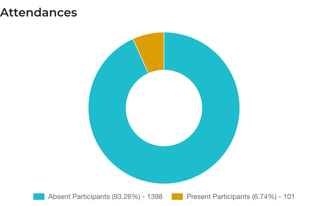
- Participant Group — View attendance across all or selected sessions within a group.
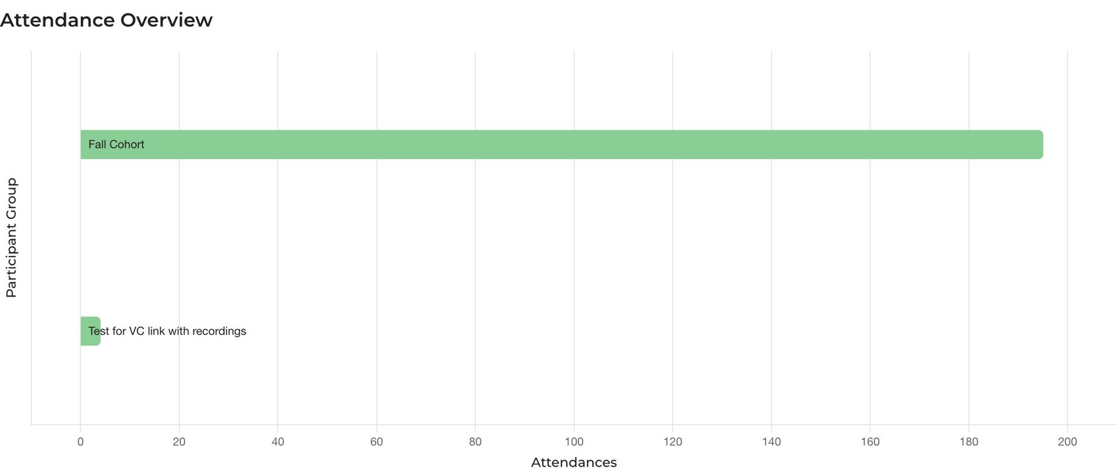
- Program — View attendance across multiple or all participant groups in a program.
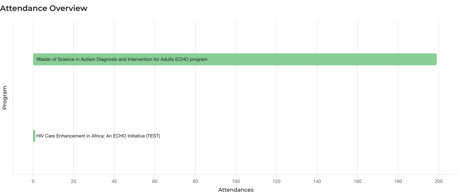
What to look for?
- A sudden drop in attendance during a specific week: did a session get canceled, or did something happen in that period (a holiday, an exam period, a regional disruption)?
- Weeks with no bar mean no sessions were held during that period.
Tip: Use the Monthly view to show trends over a quarter or year. It presents cleaner data for stakeholder reports.
2. Participants Engagement Rate
For each time period, this stacked bar chart shows what percentage of participants stayed for different durations of the session—whether they joined briefly and left, or stayed until the end.
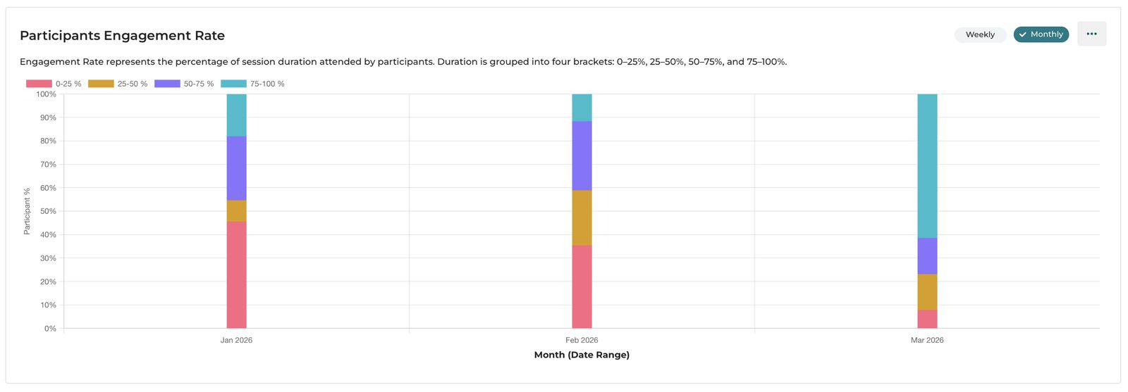
Engagement Rate represents the percentage of session duration attended by participants. Duration is grouped into four brackets: 0–25%, 25–50%, 50–75%, and 75–100%.
The four brackets explained:
| Color | Bracket | What It Means |
|---|---|---|
| Pink | 0–25% of session | Joined and left very early—in the first quarter of the session |
| Orange | 25–50% | Stayed for roughly the first half |
| Purple | 50–75% | Stayed for most of the session |
| Teal | 75–100% | Stayed until (nearly) the end |
The drill-down table (click the ... button on the chart) shows exact counts broken down as:
- Left during 0–25% of session duration
- Left during 25–50% of session duration
- Left during 50–75% of session duration
- Stayed after 75% of session duration ← this is what you want to maximize
What to look for?
- A large teal segment (75–100%) is your best outcome—most participants stayed engaged throughout.
- A large pink segment (0–25%) is a warning. Many people joined and immediately left. This can mean: Zoom link was opened just to mark attendance, a technical issue disrupted the session start, or participants had scheduling conflicts.
- Watch for sessions where the 50–75% bracket is dominant—participants are leaving in the last quarter. This sometimes happens when sessions run long and participants have other commitments.
Tip: Are your sessions typically ending on time? Are participants leaving before the case discussion or Q&A because the session runs too long?
3. Focus Areas
The Focus Areas chart fetches a word cloud of focus areas that the organization targets through its programs.
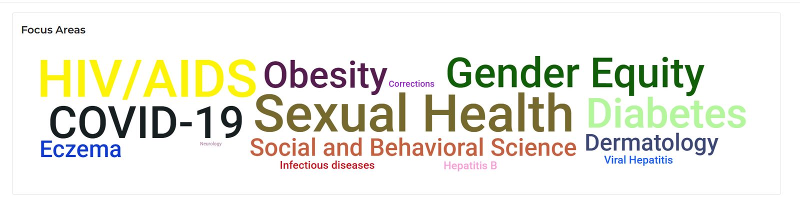
See which focus areas your programs are reaching most. Larger text = more participants in that area.
4. Session Join-Time Comparison
For each time period, see how many participants joined the session on time versus how many joined late.
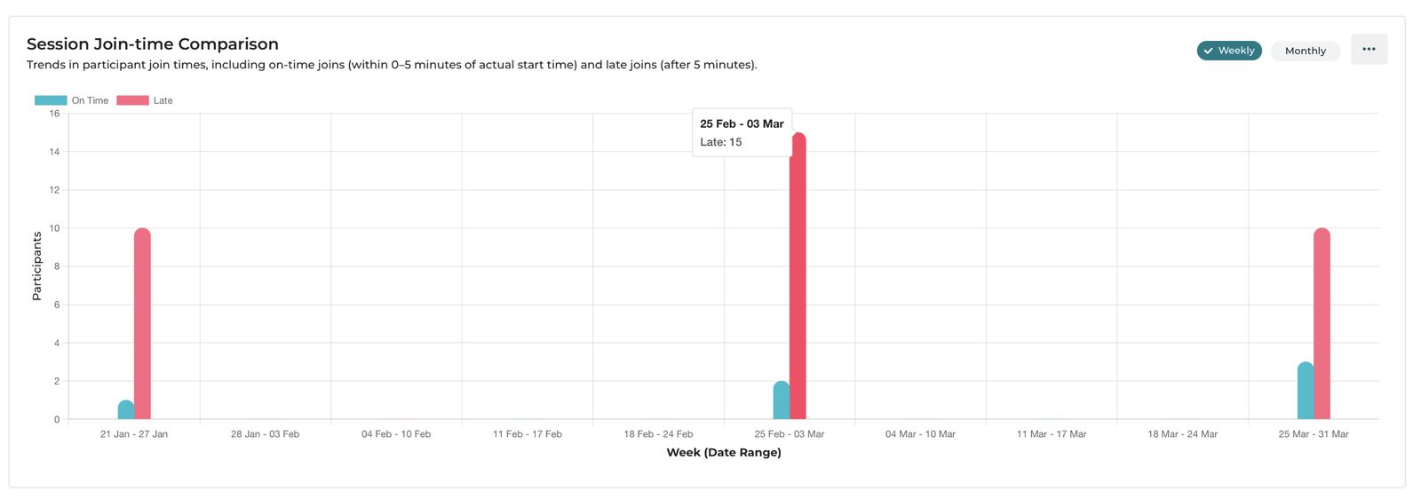
"Trends in participant join times, including on-time joiners (within 0–5 minutes of actual start time) and late joiners (after 5 minutes)."
Definitions:
- On Time (teal): Joined within 5 minutes of when the session actually started on Zoom.
- Late (pink/red): Joined more than 5 minutes after the session actually started.
The drill-down table shows exact On-time Participant Count and Late Participant Count per month or week.
What to look for?
- A month where on-time attendance significantly drops may indicate the session started unexpectedly late, or participants in that region had disruptions.
Practical steps if late joining is high:
Check whether sessions are consistently starting on time—if the host typically opens Zoom late, participants will adjust their arrival time accordingly.
5. New vs. Returning Participants
For each session date or time period, see how many participants were joining an iECHO session for the very first time versus how many had attended before.
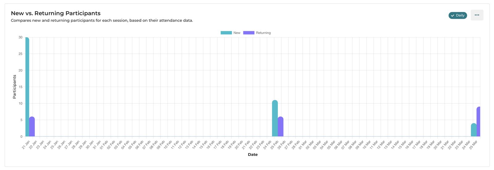
Compares new and returning participants for each session, based on their attendance data.
Definitions:
- New (teal): A participant who has never attended any iECHO session in this participant group.
- Returning (purple): A participant who has attended at least one previous session in this participant group.
The drill-down table shows New Users and Returning Users per day, week, or month.
What to look for?
- In a healthy, growing program, you'll see returning participants form a steady, growing base (tall purple bars), with occasional spikes of new participants when new learning sites join or an outreach campaign runs.
- If new participants are consistently high but returning numbers are low, participants are trying the program but not coming back. Communicate with participants to learn what is preventing them from attending sessions.
Key insight for hubs: A program where 80%+ of participants are returning is a program that participants find valuable enough to keep showing up for. That is a powerful data point for funders and governing bodies.
6. Professional Distribution of Participants
A horizontal bar chart breaking down your participants by profession—Teachers and Professors, Teaching Assistants, Faculty, Healthcare Personnel, and so on.
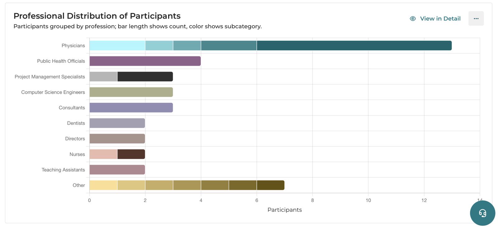
Each bar represents a broad professional category. The color segments within each bar represent sub-categories within that profession. You can click View in Detail to see a more detailed breakdown.
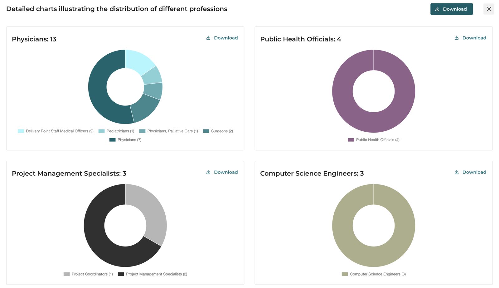
What to look for?
- Is the program reaching the intended professional audience? If your program targets frontline healthcare workers but most participants are administrative personnel, there may be a mismatch between outreach and actual enrollment.
- Use this to tailor session content. A session attended primarily by professors may need different framing than one attended primarily by clinical practitioners.
7. Geographical Presence
A world map visualizing where your participants and learning sites are located.
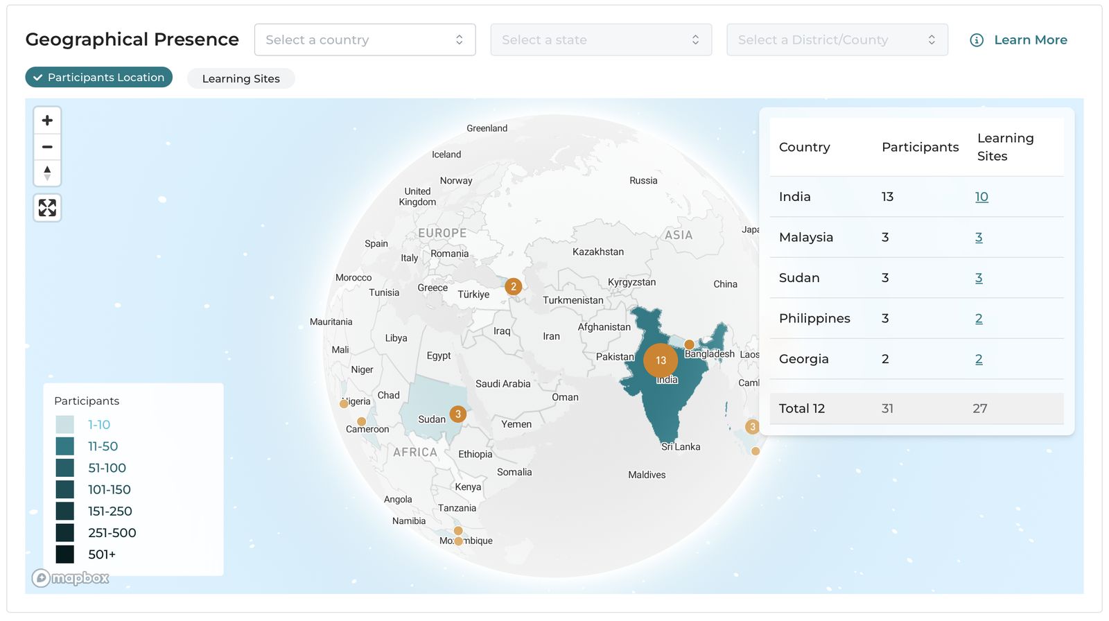
Two views available:
- Participants Location — shading shows the number of participants from each country/region.
- Learning Sites — shading shows the number of distinct organizations (learning sites) in each country/region.
The color legend uses intensity to show concentration:
- Light teal = 1–10 learning sites
- Progressively darker = 11–50, 51–100, 101–150, 151–250, 251–500, 501+
The table on the right shows Country, Participants, and Learning Sites for each country in your filtered view. You can also filter by country, state, or district/county using the dropdowns at the top.
State / Province level breakdown is available for most countries. District / County breakdown is currently available only for U.S. and India. We are working on bringing more geographical data options to more countries. If you would like to see additional geographical breakdown in your country, you can raise a feature request.
What to look for?
- Are there large participant clusters in a particular state or district? This could guide decisions about where to focus future outreach.
8. Net Promoter Score (NPS)
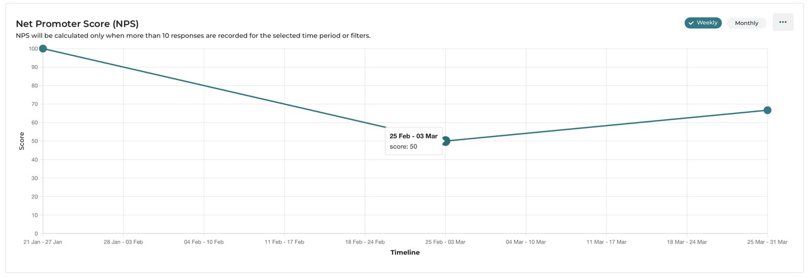
The line graph shows the NPS score over sessions calculated weekly or monthly. This is calculated when more than 10 responses are recorded for the selected time period or filters.
Which feedback question drives this?
Participants are asked: "How likely are you to recommend this program to a colleague?" on a scale of 0 to 10.
Based on their answer, each participant is classified as:
| Score | Classification | What It Means |
|---|---|---|
| 9–10 | Promoter | Enthusiastic supporters—they would actively recommend your program |
| 7–8 | Neutral | Satisfied but not enthusiastic—unlikely to recommend or criticize |
| 0–6 | Detractor | Unhappy participants—may discourage others from joining |
How the NPS score is calculated:
NPS = % of Promoters − % of DetractorsExample: If 68% of respondents scored 9–10, and 4% scored 0–6:
NPS = 68 − 4 = 64
Important rule: NPS is only calculated and displayed when more than 10 feedback responses have been recorded for the selected time period or filters. Below this threshold, the chart shows no score because a result from fewer respondents would not be reliable.
How to read the score:
| NPS Range | What It Signals |
|---|---|
| Above 70 | Exceptional—your participants are strong advocates |
| 50–70 | Very good—program is highly regarded |
| 30–50 | Good—room to improve but on a solid footing |
| 0–29 | Average—more satisfied than dissatisfied, but worth investigating |
| Below 0 | More detractors than promoters—this needs attention |
What to do with it?
- Compare NPS across the timeline to see which sessions participants didn’t find useful.
- A sudden drop in a particular week may point to a session that did not go well—cross-reference with which session occurred that week.
- An NPS consistently above 70 is strong evidence of program quality worth sharing with funders.
9. Participants Gender Distribution
A donut chart showing the split between male and female participants in the selected time range.
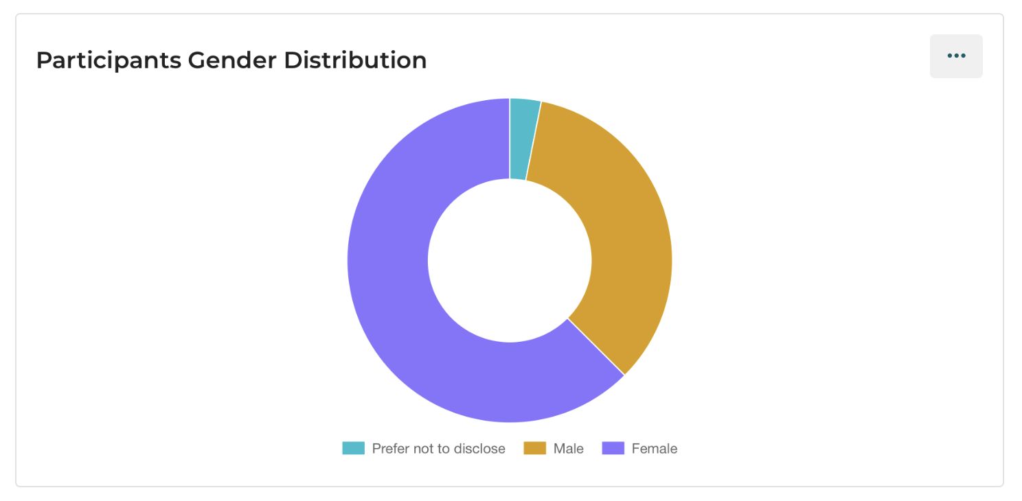
What to look for?
- Is your program reaching a gender-balanced audience? For programs focused on women's health, maternal health, or gender equity topics, this data is particularly meaningful.
- A large gender imbalance may reflect the professional composition of your region's health or education workforce—or it may point to an outreach opportunity.
10. Content Categories
A donut chart showing the breakdown of materials shared in sessions by content type:
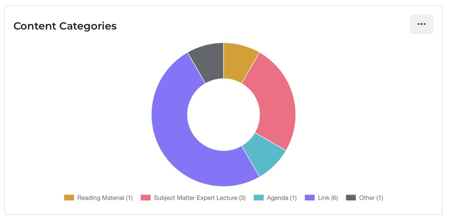
| Category | Description |
|---|---|
| Case Presentation | Materials shared as part of a case-based discussion |
| Guest Lecture | Materials shared by an invited expert |
| Agenda | Session agenda documents |
| Subject Matter Expert | Materials from a subject matter expert |
| Reading Material | Background reading shared with participants |
| Additional Resource | Supplementary materials |
| Other | Any other material type |
What to look for?
- A high proportion of Case Presentation materials is expected and positive—it reflects the ECHO model in action.
- If Reading Material or Agenda dominate but Case Presentation is low, the sessions may be more lecture-heavy than case-based.
11. Content Engagement
The Content Engagement line graph visualizes how participants interact with learning materials shared during iECHO sessions. It tracks three key engagement actions over time within the selected filters and date range:
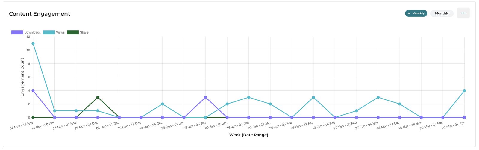
- Views – Number of times participants opened or accessed a content item.
- Downloads – Number of times participants downloaded the material for offline use.
- Shares – Number of times participants shared the content with others.
You can toggle between Weekly and Monthly views to analyze short-term engagement patterns or longer-term trends.
How the data is calculated:
- Views: Counted each time a participant opens a content file within the platform.
- Downloads: Counted when a participant downloads a file to their device.
- Shares: Counted when a participant uses the platform’s sharing functionality.
- Aggregation: Engagement metrics are summed across all content types and sessions within the selected program, batch, session, and time range.
How to read the chart:
- Peaks in Views often indicate sessions with highly relevant or widely promoted materials.
- Downloads following Views suggest that participants found the content valuable enough for future reference.
- Shares, although typically lower in number, signal that participants perceive the content as useful for their broader professional network.
- Periods with no activity may correspond to weeks with no sessions or when no materials were uploaded.
12. Content Interaction and Most Viewed Content
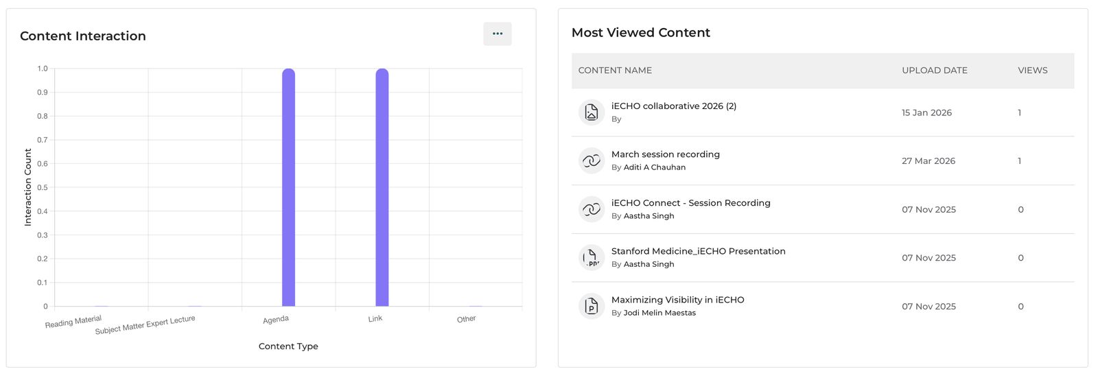
Content Interaction shows how many times participants interacted with materials across different content categories (bar chart).
Most Viewed Content is a ranked table showing which specific files were viewed most, when they were uploaded, and their view count.
What to look for?
- Materials with zero views despite being uploaded may not be discoverable—check how they are being shared with participants.
- The most-viewed materials give you a signal about what participants find most useful. If a reading on a particular topic gets high views, that topic resonates with your audience.