The Forms tab shows data from all the forms that participants complete before and after each session. Understanding this data helps you measure whether your program is actually improving knowledge and practice, not just whether people are showing up.

| Metric | Calculation | Why It Matters |
|---|---|---|
| Forms Created | The number of forms created and attached to a participant group in the selected period. This includes feedback forms, pre-assessments, and post-assessments. | |
| Feedback Responses | The total number of feedback forms submitted by participants in the selected period. | This is your raw feedback volume. A high number here gives you more confidence in the other feedback metrics — NPS, knowledge level, and so on. If this number is low, interpret charts like NPS with caution. |
| Pre-Assessment Responses | The number of participants who completed a pre-session knowledge assessment (before the session began). | |
| Post-Assessment Responses | The number of participants who completed a post-session knowledge assessment (after the session ended). | Ideally, pre-assessment and post-assessment counts should be similar. If far fewer participants completed the post-assessment, some may have dropped off or not attended. |
| Avg Net Promoter Score | The average NPS score across all sessions in the selected time range. |
1. Net Promoter Score
A single number — the gauge dial you see on screen — summarizes how strongly participants would recommend your program to a colleague. The score can range from −100 to +100.
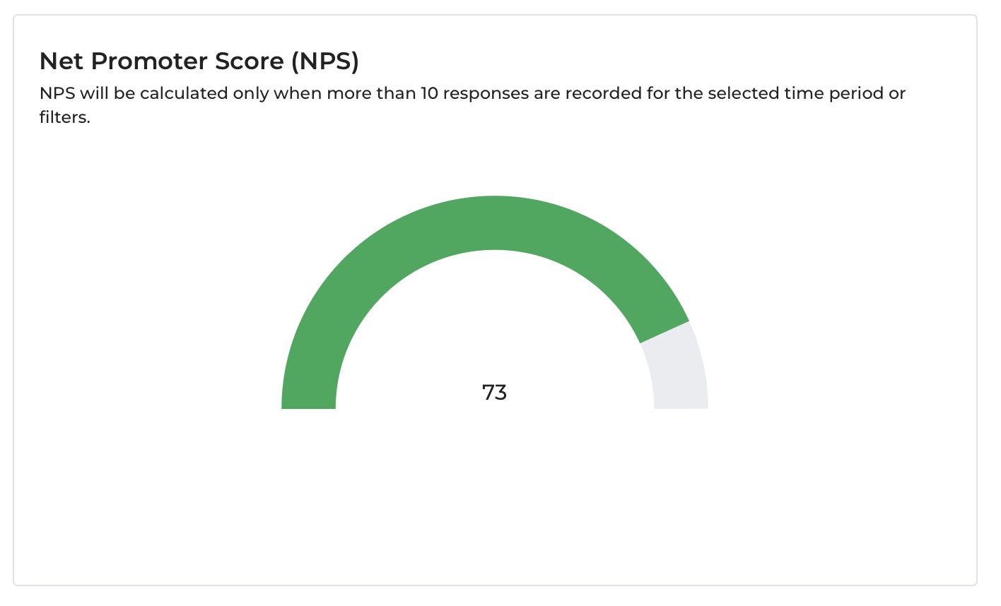
Which feedback question drives this?
Participants are asked: "How likely are you to recommend this program to a colleague?" on a scale of 0 to 10.
Based on their answer, each participant is classified as:
| Score | Classification | What It Means |
|---|---|---|
| 9–10 | Promoter | Enthusiastic supporters — they would actively recommend your program. |
| 7–8 | Neutral | Satisfied but not enthusiastic — unlikely to recommend or criticize. |
| 0–6 | Detractor | Unhappy participants — may discourage others from joining. |
How is the NPS calculated?
NPS = % of Promoters − % of DetractorsExample: If 68% of respondents scored 9–10, and 4% scored 0–6:
NPS = 68 − 4 = 64Important rule: NPS is only calculated and displayed when more than 10 feedback responses have been recorded for the selected time period or filters. Below this threshold, the chart shows no score because a result from fewer respondents would not be reliable.
How to read the score?
| NPS Range | What It Signals |
|---|---|
| Above 70 | Exceptional — your participants are strong advocates. |
| 50–70 | Very good — program is highly regarded. |
| 30–50 | Good — room to improve, but on a solid footing. |
| 0–29 | Average — more satisfied than dissatisfied, but worth investigating. |
| Below 0 | More detractors than promoters — this needs attention. |
What to do with it?
- Compare NPS across different participant groups or programs to see where participants are most satisfied.
- A sudden drop in a particular week may point to a session that did not go well — cross-reference with which session occurred that week.
- An NPS consistently above 70 is strong evidence of program quality worth sharing with funders.
2. Response Rate Over Time
A line chart showing what percentage of participants who attended each session (or week/month of sessions) went on to complete the feedback form.
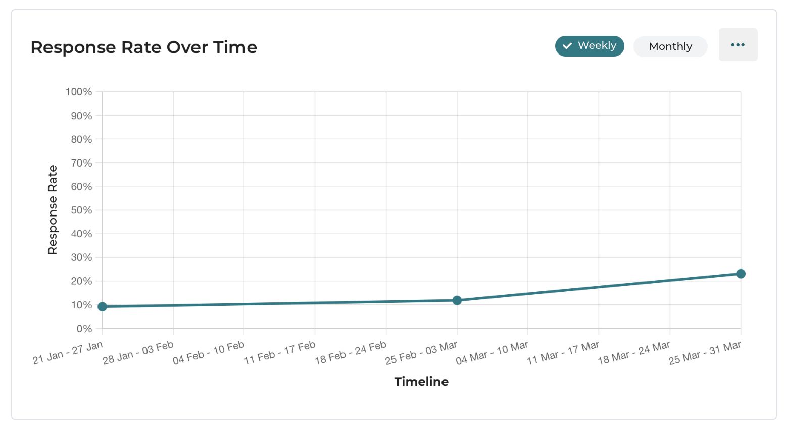
How it is calculated:
Response Rate = (Number of feedback forms submitted) ÷ (Number of participants who actually attended) × 100The drill-down table shows: Month/Week, Response Rate (%), Total Attendances, and Total Submissions, so you can see the actual numbers behind each percentage.
Why the denominator matters: Only participants who actually attended are counted in the denominator — not those who were registered but did not show up. This makes the response rate a fair measure of post-session feedback engagement.
Example from the data: In the week of Jul 25–Jul 31, 60 participants attended and 46 submitted feedback — a 76.67% response rate.
What to look for:
- A response rate above 60% is strong. It means most participants are engaged enough to spend a few minutes giving feedback after each session.
- Weeks where the response rate drops to 0% are usually weeks with no sessions (shown as N/A) — not a cause for concern.
- If the response rate is consistently below 30%, your NPS and other feedback charts may only reflect the most vocal minority — not the full audience.
How to improve response rates:
3. Net Promoter Score (NPS) Over Time
A combination chart showing how NPS has trended week by week or month by month. The stacked bars show the breakdown of Promoters (green), Neutrals (gray), and Detractors (pink/red) as percentages. The teal line shows the actual NPS score.
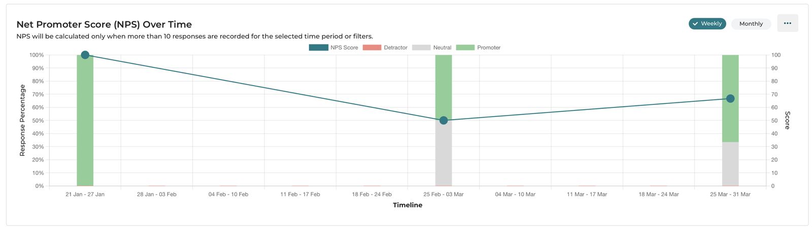
The subtitle reads:
"NPS will be calculated only when more than 10 responses are recorded for the selected time period or filters."
Periods shown as N/A in the drill-down table are weeks where fewer than 10 responses were collected or there is no session — NPS is not calculated for those periods.
The drill-down table shows: NPS Score, Promoters (%), Detractors (%), Neutral (%), Promoter Count, Detractor Count, and Neutral Count for each time period.
What to look for?
- Is the NPS line trending upward over time? That suggests the program quality is improving.
- Watch the Detractor bar (pink). Even a small percentage of detractors pulls the NPS down significantly. If detractors spike in a particular week, investigate what happened during that session.
4. Knowledge Level Comparison
A grouped bar chart comparing how participants rated their knowledge of the session topic before the session (Pre Session, teal) vs. after the session (Post Session, purple), across five levels.
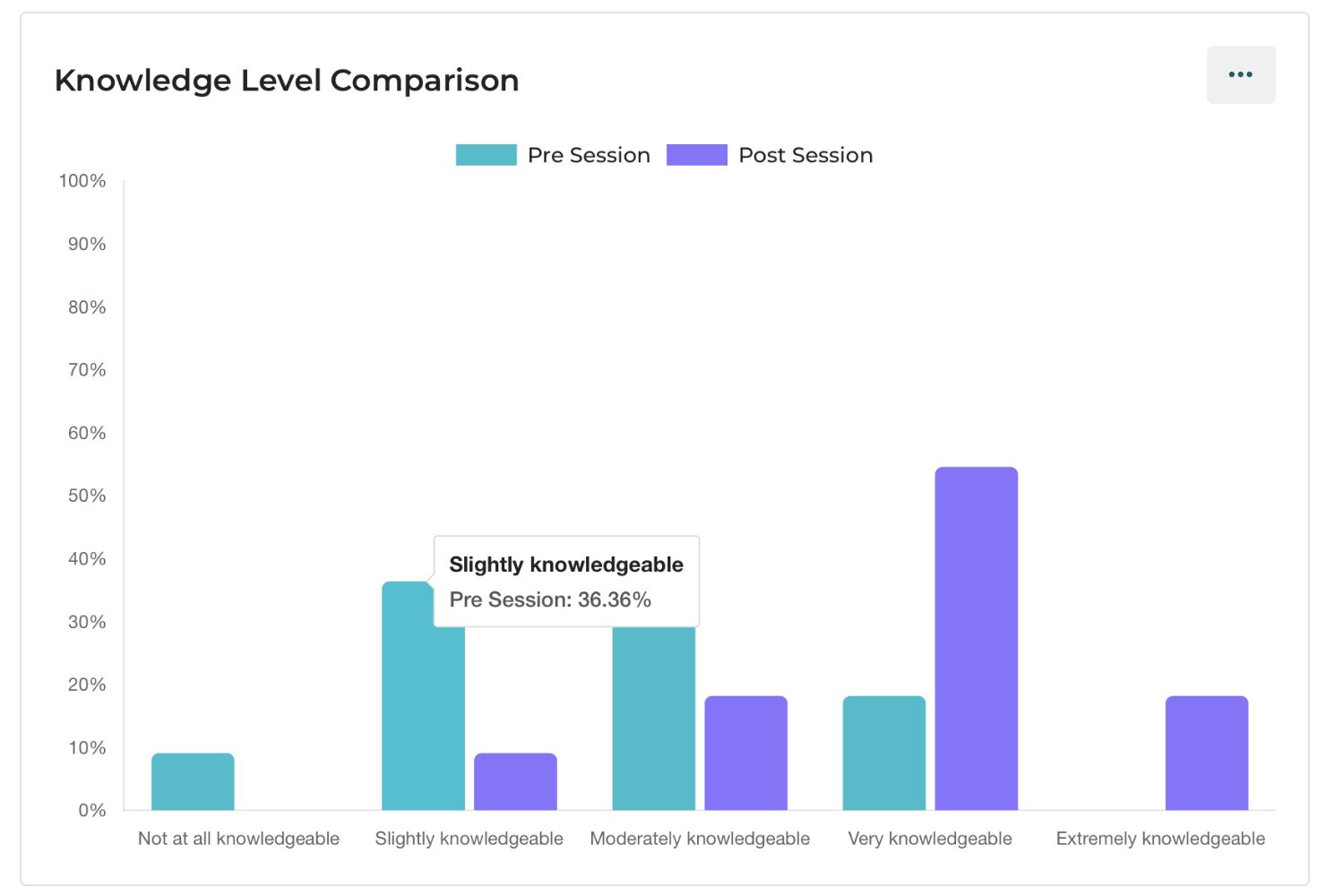
The feedback questions behind this chart:
Participants are asked two knowledge questions in the feedback form — one asking about their knowledge level before the session (pre) and one after (post). Both questions use the same five-point scale:
- Not at all knowledgeable
- Slightly knowledgeable
- Moderately knowledgeable
- Very knowledgeable
- Extremely knowledgeable
The drill-down table shows the percentage of participants at each knowledge level, for both pre and post, side by side.
How to read it?
In a successful session, you should see the distribution shift to the right — more participants moving into "Very knowledgeable" and "Extremely knowledgeable" after the session compared to before.
What to look for?
- If the pre and post distributions look almost identical, the session may not have significantly moved participants' knowledge — consider whether the content matched participants' learning needs, or whether the case presentation was pitched at the right level.
- If almost everyone was already "Extremely knowledgeable" before the session, the topic may be too basic for this audience.
5. Will You Use What You Learned in This Session?
A bar chart showing how participants responded to the intention question in the feedback form — whether they plan to apply what they learned in their clinical or professional practice.
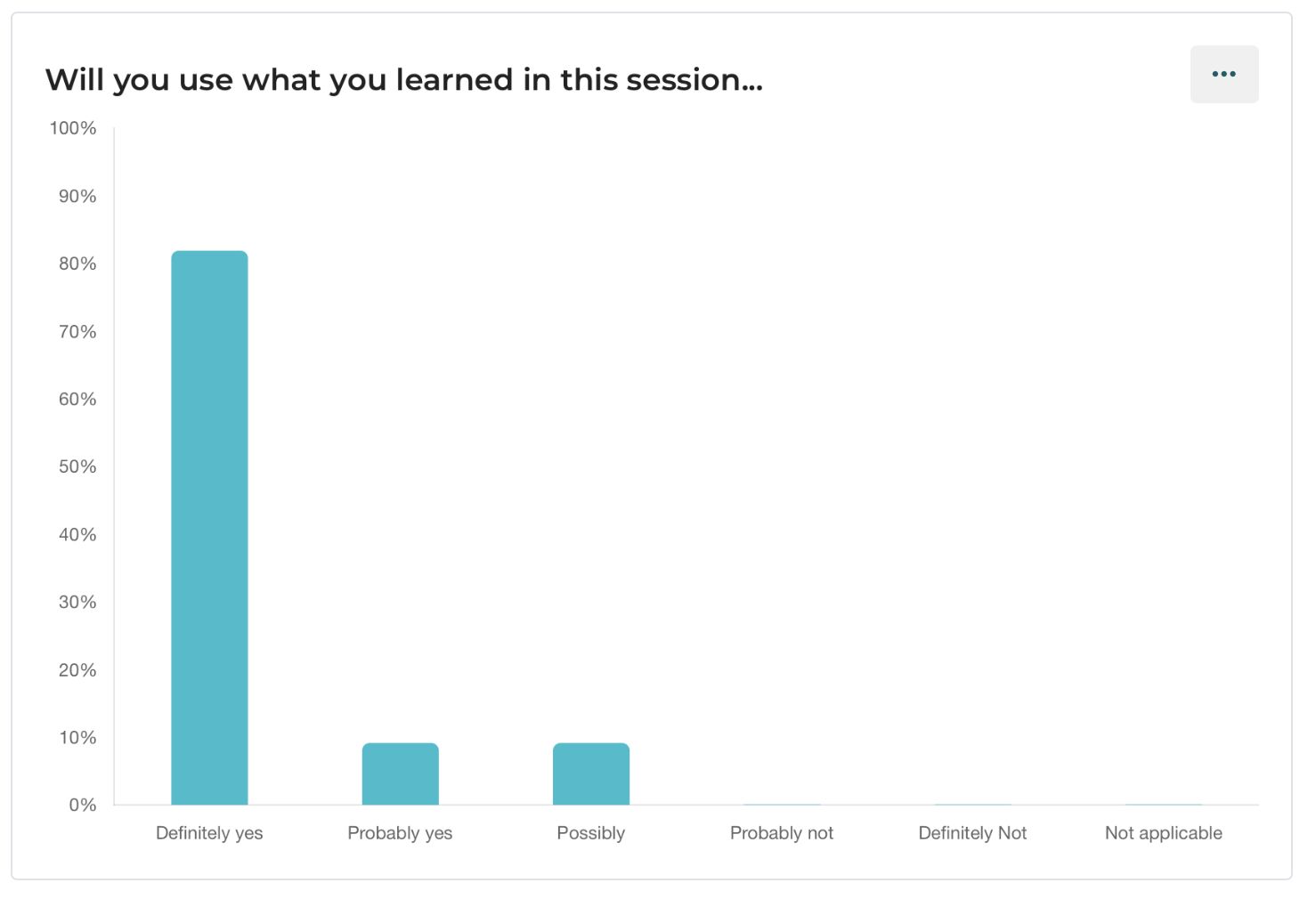
The feedback question:
"Will you use what you learned in this session in your work?"
Answer options:
| Option | What It Signals |
|---|---|
| Definitely yes | High intention — participant is ready to apply the learning immediately. |
| Probably yes | Positive intention — likely to apply it when the situation arises. |
| Possibly | Uncertain — may apply it depending on context. |
| Probably not | Unlikely to apply. |
| Definitely not | Not relevant to their practice. |
| Not applicable | The topic does not apply to their professional role. |
The drill-down table shows the percentage of participants who selected each option.
What to look for?
- A high "Definitely yes" + "Probably yes" combined percentage (above 70%) means the session content is being perceived as practically relevant — not just academically interesting.
- A high "Not applicable" percentage may mean participants from professions outside the intended audience are attending, or the case topic was too specialized.
- A high "Probably not" or "Definitely not" response is rare, but warrants a conversation about whether the session content is pitched at the right level for this group.
6. How Relevant Is This Session to Your Current Work?
A bar chart showing how participants rated the relevance of the session content to their current professional work.
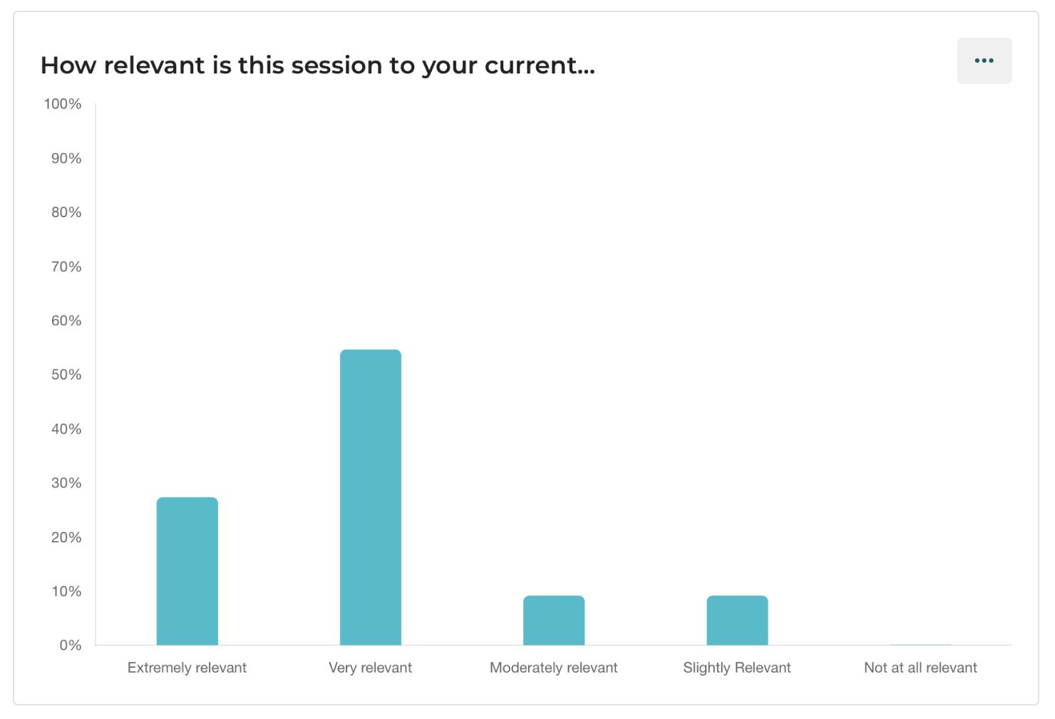
The feedback question:
"How relevant is this session to your current work?"
Answer options:
- Extremely relevant
- Very relevant
- Moderately relevant
- Slightly relevant
- Not at all relevant
The drill-down table shows the percentage for each option.
What to look for?
- A shift toward "Moderately relevant" or below across multiple sessions suggests the topics being covered may not be closely aligned with what participants need for their day-to-day work.
- Consider this chart alongside the Professional Distribution of Participants — if your participant mix has shifted toward a different profession group, the relevance of existing topics may have changed.
7. What Is Your Opinion of the Balance of Lecture and Interactive Learning?
A horizontal bar chart showing participants' feedback on whether the session had the right mix of expert-led teaching and interactive case-based discussion.
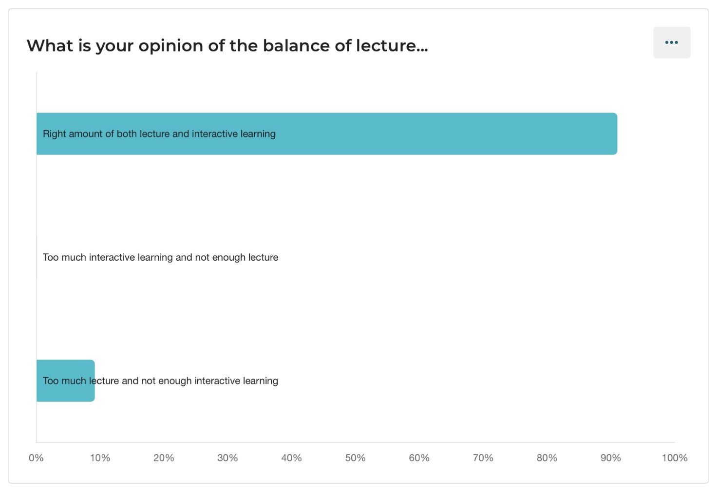
The feedback question:
"What is your opinion of the balance of lecture and interactive learning in this session?"
Answer options:
| Option | What It Means |
|---|---|
| Right amount of both lecture and interactive learning | The session format felt balanced — the ideal outcome. |
| Too much interactive learning and not enough lecture | Participants wanted more structured teaching. |
| Too much lecture and not enough interactive learning | Participants wanted more case discussion and Q&A. |
The drill-down table shows the percentage for each option.
How to read it?
If a large number of participants felt the session had the right balance, that is a strong endorsement of the session format.
What to look for?
- If "Too much lecture" is a recurring response, your sessions may be drifting away from the ECHO model's case-based discussion format toward traditional webinar-style delivery.
- If "Too much interactive learning" is high (rare but possible), some participant groups — particularly those newer to ECHO — may be less comfortable with open discussion and prefer more structured expert input.
- Track this over time. If you recently changed your session format and this chart shifts, the change is being noticed by participants.